I've been waiting to write a post on responsive web design (RWD) for a long time. I think it's a really powerful tool for websites that care about usability and UX. Definitions for RWD vary depending on the source because it's a relatively new 'technology', but I would describe it as developing a website in such a way that the layout/look responds accordingly as the browser changes by dimension or by device.
There's an important distinction to make about my definition. Just because a website looks different on a mobile device than it does on your computer, doesn't necessarily make that website responsive. A lot of websites detect whether you are viewing the website on a computer, phone, or tablet and either serve up a separate CSS file specifically built for that device type or they might even serve up a completely separate mobile version of their website or application.
For example, if you use 37signals' Basecamp product and you login on your computer versus logging in on your phone, you will be using their product on two completely different development frameworks. I don't doubt that they use some responsive elements in their design, but RWD is when it's the same exact website that uses a combination of specific RWD techniques, such as media queries, to alter your client-side interaction while the server-side code remains the same.
It should also be noted that RWD isn't for all websites. If you have a very large website (i.e. 50+ pages), it's going to be very hard to make all those pages responsive with any continuity without sinking an excessive amount of time into it, especially if your layouts differ from page to page. It also adds overhead in the sense that any design change requires another level of upkeep and quality assurance.
If this still isn't making sense, I listed a couple example below that illustrate what RWD looks like in action.
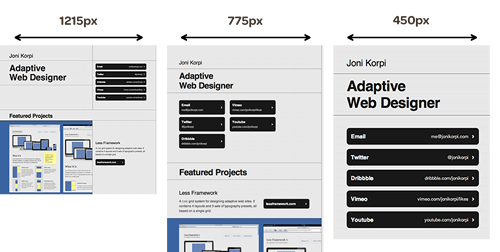
The most simple use case for this is adding it to your personal website. A really good example of RWD in action is Joni Korpi's personal website. I meant to write about Joni Korpi in my web designer portfolio post, but his three-tier responsiveness was too perfect for this one.
If you look at the picture below, you'll notice there are 3 different layouts to his website. Each layout corresponds to a certain browser dimension. If you go to his website (it's been re-designed since I captured the images) and re-size your browser to those dimensions, you'll notice the website's layout/design changes on the fly - it's pretty cool.
Next up is the French Earth Hour conference website. On a quick tangent - I think the colors of this website are awesome. Anyways, I only noticed two different responsive designs for this website as you see below. For some websites, that's all you really need. The creators of this website probably only wanted to optimize the design for full-width and standard mobile dimensions; I'm guessing this is the case because people typically hear about a conference through email, social media (both viewed in full width browser) or through oral referrals away from the computer (mobile browser). Something especially cool about what they did for their second layout (the one on the right) is that they removed some elements of the page to ensure the most important content was still above the fold - sweet trick.
Last, but not least, is Trent Walton's blog. Websites that contain content that can be consumed on multiple mediums is the most natural need for RWD in my opinion. I spent a good amount of time inspecting the source/CSS of Trent's blog as it was very helpful for building my new website's layout in a flexible and fluid way that is optimized for RWD.
As I just mentioned, I'm currently re-building my personal website, hence the lack of posts, but one of the first things I'm going to do once it's finalized is start working on making it responsive - which I'll attempt to document the best I can for another post. If you're looking to make your website responsive, I would check out the following posts:
- FitText - jQuery plugin for inflating web type to make font-sizes flexible
- ThinkVitamin Media Queries: Introduction - video demo of media queries and fluid layouts
- A List Apart: Responsive Web Design - detailed write-up about RWD from people who are much better at writing than I am :)


